


Today I want to touch on something that is asked in every inquiry I receive. What do we wear?
For some of you, this is super easy. You’re fashionistas and way more on point than I could ever be… so don’t worry… I am not going to talk about style. When it comes to clothing, style is always personal. It’s one of those things that allows you to tell people who you are without ever speaking. I would NEVER want to change that part of you – especially when you hired me to capture YOU.
So let’s talk about color and print.
Firstly, stay away from neons and fluorescents. Reflective colors do just that, reflect. If you have on a lime green shirt, that green will reflect into your face and make any visible skin take on a greenish tint. The same goes for bright orange, pink, red, and yellow.
Secondly, logos and pictures. When you pay for professional pictures you want them to be about you, not your favorite brand, team, or activity. Plus when you move and sit the image gets distorted and wrinkled and can become indiscernible. It will appear as a blob in the middle of chest or back.


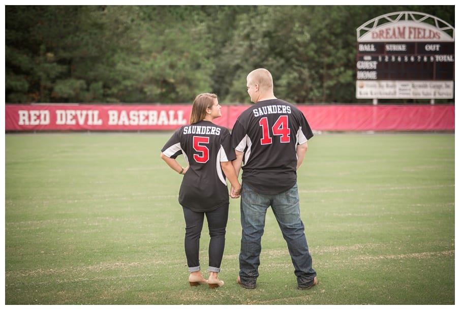
There CAN be exceptions to this. Jersey’s, for example, can have meaning and can be worked in for a portion of the session. Care will be taken on my end to make sure they stay legible.
There used to be a rule that said to stay away from prints like stripes, polka dots and plaids… but thankfully those rules are gone and I welcome patterns on clothing. They are fun and they add lots of personality!
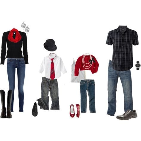
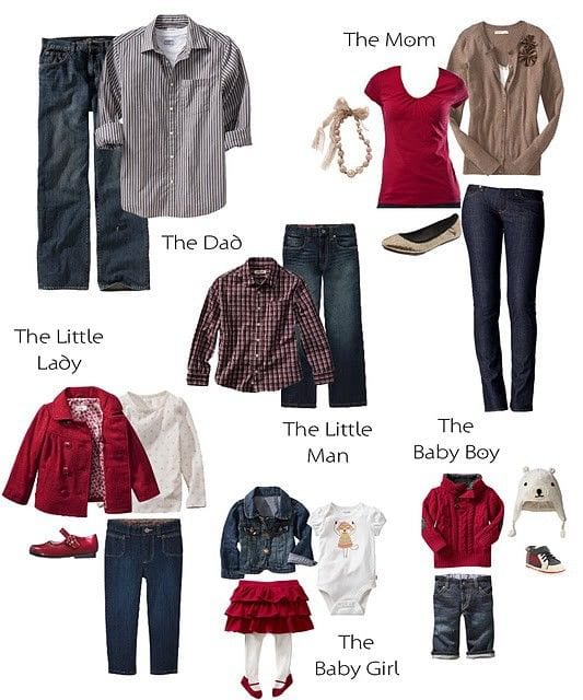
If you’re planning a family session or couple’s session… or really any kind of session that involves more than one person, finding outfits for everyone can be daunting. Unless you’re twins.. you don’t want to look like twins. Everyone wearing the same thing is boring and also can cause everyone to literally blend together. For example, a big trend is wearing white shirts and kaki pants or jeans on the beach. I get the idea behind it… you want that laid back, fun, family look. What ends up happening is all the white shirts blend together and it looks like floating heads on top of a white ball. (I was going to insert an example here… but didn’t want to rip off another photographer so trust me and google it.)
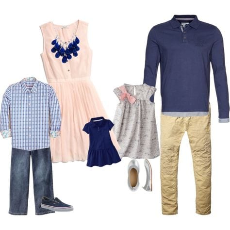
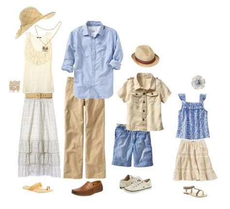
The key is to COORDINATE colors – not to match. Pinterest is an excellent resource to help with this. Simply type in “Coordinating Family Outfits”. You’ll see hundreds of ideas right in front of you! Incorporate your own style and Viola! Below are some options for you to take a look at!
Following these few simple rules can help take the stress out of the front end of your session. It will help create images that you’d be proud to display in your home for years!
XOXO
What To Wear | Intentional Creating
February 29, 2016
published
richmond weddings
Virginia Bride
washingtonian bride & groom
The knot
today.com
The black tie bride
why you should work with us
There isn't a day that goes by that I don't think about my clients. Past, present, and future. I strive for a relationship that extends further than their wedding day. The industry is constantly changing and I strive to keep up with new standards while holding true to my style.
We value our clients time, energy and strive to make the experience easy and fun.


